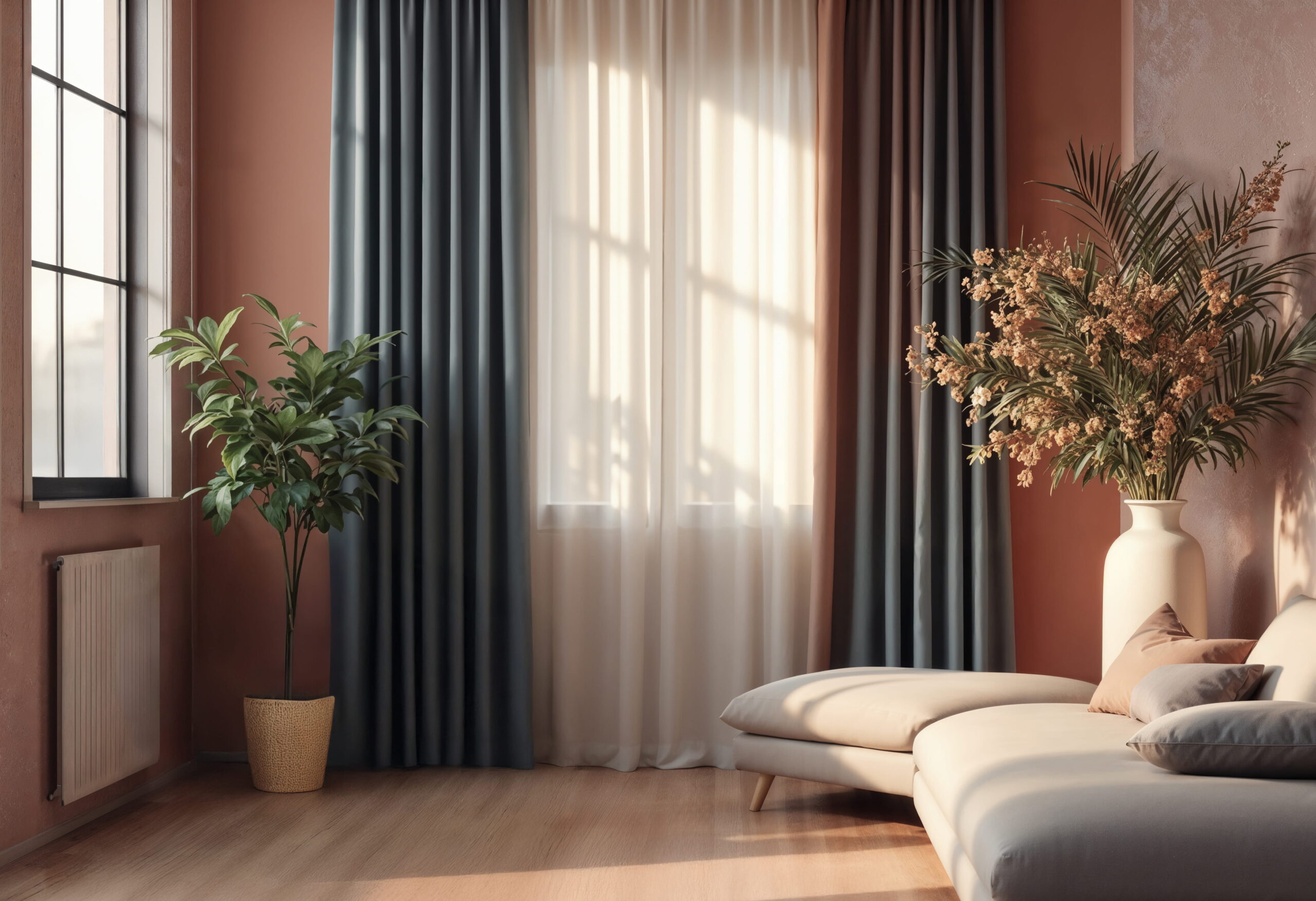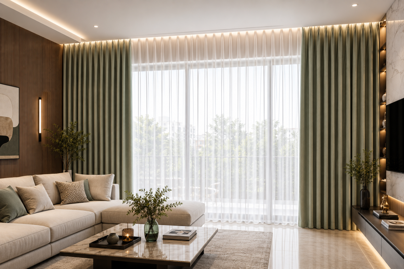
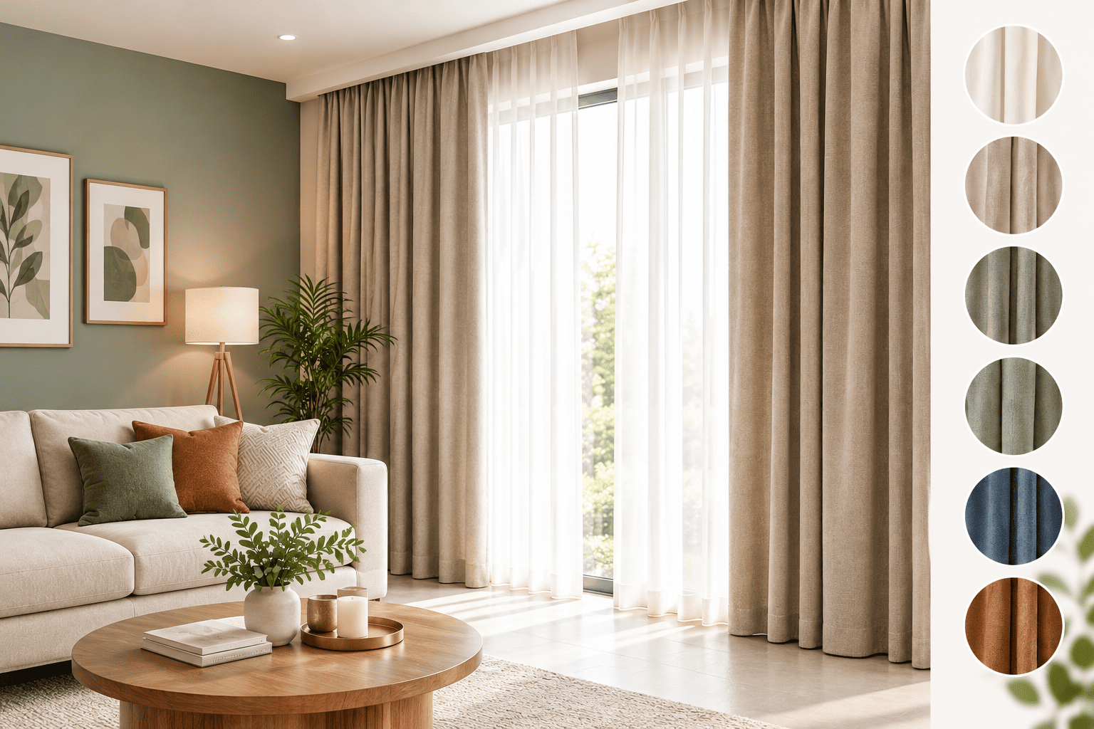
Choosing a curtain colour sounds easy.
Until you walk into a showroom and see hundreds of fabrics.
Suddenly you start asking:
Should I match the curtains with the wall?
Should they match the sofa?
Should I choose a darker colour?
Will beige look boring?
Will a bold colour make the room too busy?
Should every room have the same curtain colour?
These are common questions.
And there is no single colour that is right for every home.
The right curtain colour depends on the walls, furniture, flooring, natural light, room size, fabric texture and the overall feeling you want to create.
Curtains are also one of the largest areas of fabric in a room. Their colour can therefore have a much greater visual impact than many people expect.
At Zed’s, we believe curtain selection should begin with the room—not simply with the fabric catalogue.
1. Don't Choose the Curtain Colour First
This may sound surprising.
But when you are furnishing an existing room, choosing the curtain colour should usually come after you understand the room’s existing colour palette.
Look at:
- Wall colour
- Sofa
- Flooring
- Carpets and rugs
- Bed upholstery
- Cushions
- Wooden finishes
- Artwork
- Decorative accessories
- Natural light
Your curtain does not have to match everything.
In fact, matching everything exactly can sometimes make a room look flat.
A better approach is to create a relationship between the curtain and the existing elements.
For example, your curtain may:
- Blend with the wall colour
- Pick up a colour from the sofa
- Echo the rug
- Complement the flooring
- Repeat a colour from artwork or cushions
- Introduce a carefully chosen accent
The objective is coordination, not duplication.
2. Should Curtains Match the Walls?
This is one of the most common questions customers ask.
The answer is:
They can—but they don’t have to.
There are three basic approaches.
Same Colour Family
Choose curtains that are close to the wall colour but slightly lighter or darker.
This creates a calm, continuous appearance.
It works particularly well in modern and minimalist interiors.
Complementary Colour
Choose a colour that works harmoniously with the wall without being the same.
For example, a warm neutral wall may work beautifully with taupe, oatmeal, beige or a soft earthy shade.
Contrast
Use the curtain as a deliberate accent.
A deeper green, blue, terracotta or another richer colour can create a stronger focal point.
The important thing is that the contrast should look intentional.
3. Should Curtains Match the Sofa?
Again, not necessarily.
One of the easiest mistakes is to take the sofa fabric and search for exactly the same curtain colour.
That can work, but it can also make the room look overly coordinated.
Instead, look for a colour relationship.
Suppose your sofa is:
Beige
You could consider:
- Warm ivory
- Taupe
- Sand
- Olive
- Soft brown
- Muted green
- A deeper accent colour
Suppose your sofa is:
Navy blue
You could consider:
- Soft white
- Warm beige
- Light grey
- Stone
- Blue-grey
- A complementary earthy tone
The curtain doesn’t have to copy the sofa.
It needs to work with it.
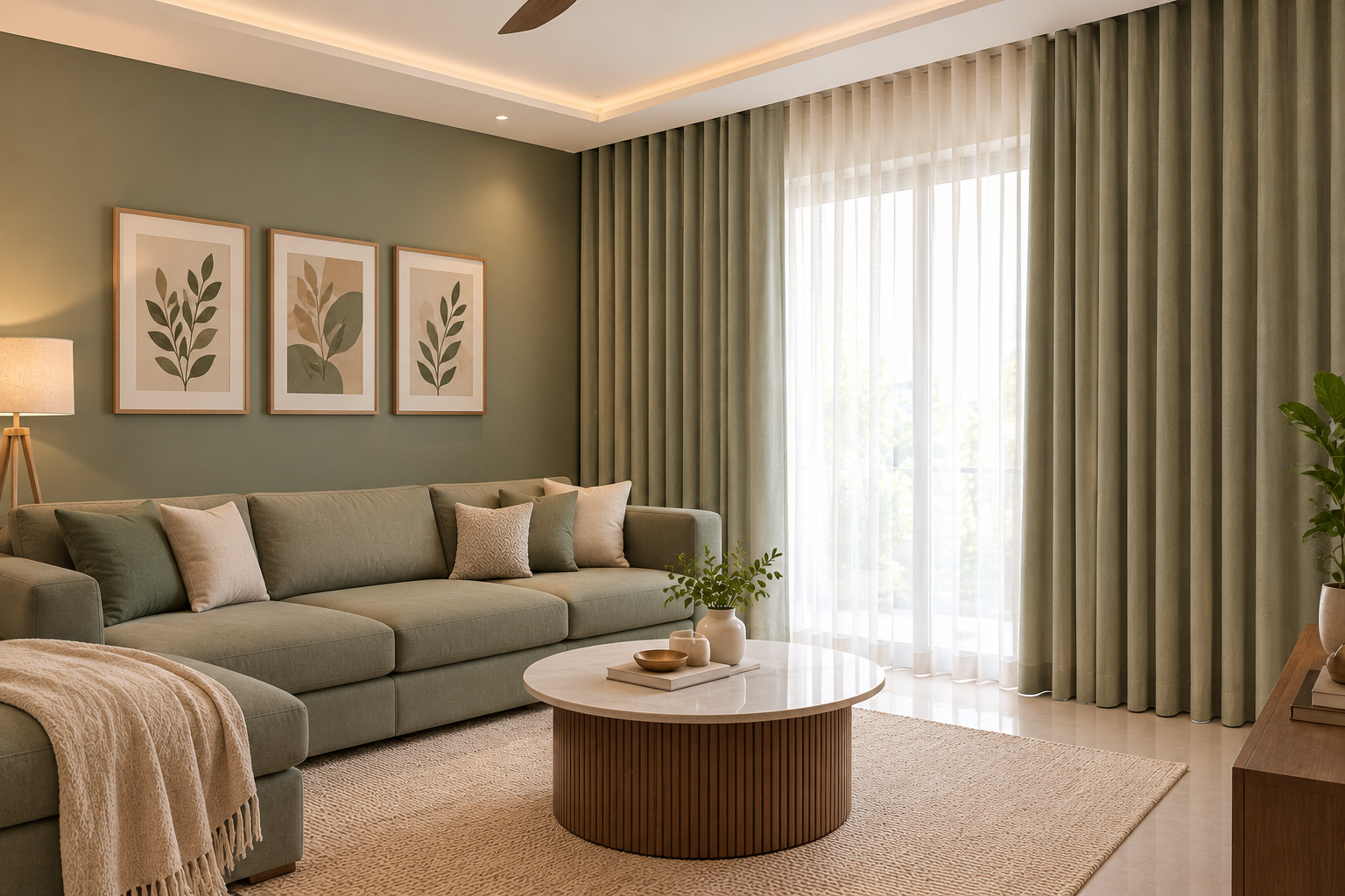
4. Consider the Natural Light in the Room
The same curtain colour can look completely different depending on the amount and direction of natural light.
A room with strong sunlight may make colours appear brighter.
A darker room may make the same fabric appear deeper and heavier.
This is particularly important in a place like Mangalore, where natural daylight can be strong and the orientation of the room can significantly affect how a fabric appears.
That is why choosing a curtain colour from a small photograph or online screen can be misleading.
Always look at the actual fabric in the room’s lighting whenever possible.
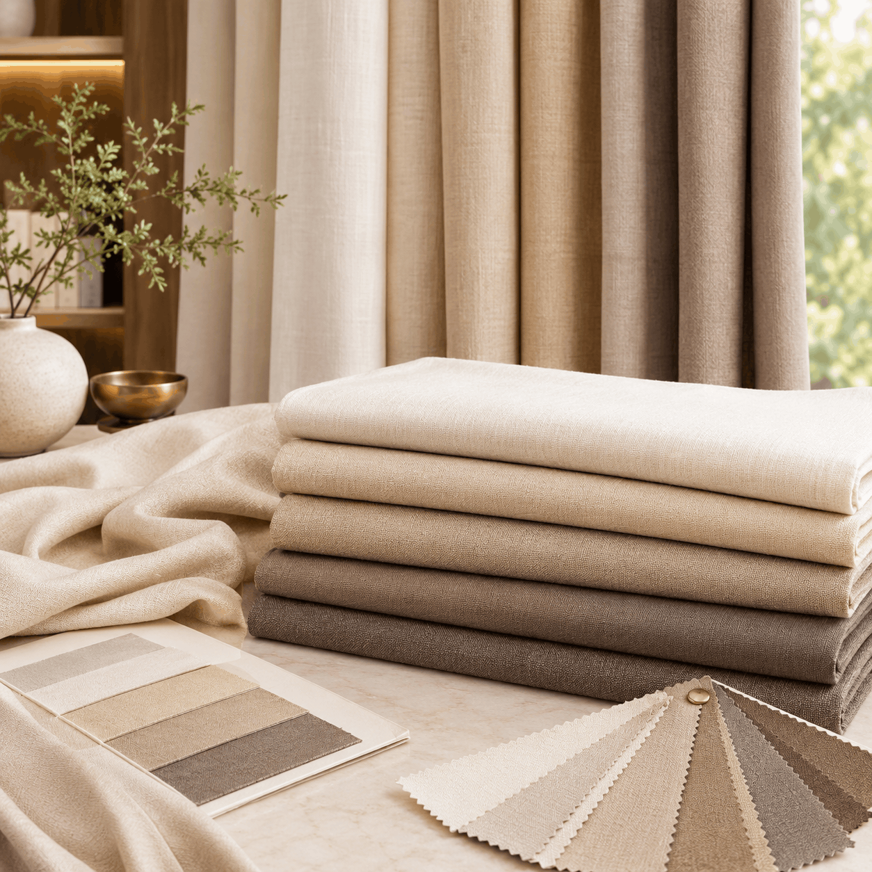
5. Light Colours Can Make a Room Feel More Open
Lighter curtain colours can create a visually softer and more open appearance.
Consider:
- Ivory
- Cream
- Warm white
- Beige
- Sand
- Oatmeal
- Light taupe
These colours can work particularly well when you want the curtains to complement rather than dominate the room.
They are also useful when the room already has strong architectural features, artwork or statement furniture.
But remember:
Light does not automatically mean boring.
Texture can make a huge difference.
A plain ivory linen-look fabric can create a very different effect from a smooth ivory polyester fabric.
6. Dark Curtains Can Create Drama
Darker curtain colours can make a strong design statement.
Think about:
- Charcoal
- Deep green
- Navy
- Chocolate
- Burgundy
- Plum
- Deep blue
They can work particularly well when the rest of the room has enough visual balance.
Dark curtains can also frame a large window beautifully.
However, in a small or already dark room, a very deep curtain colour can make the window treatment visually heavier.
The question isn’t:
“Are dark curtains good?”
The better question is:
“Does this room have enough balance for a dark curtain?”
7. Don't Forget the Flooring
Customers often look at the walls and sofa but forget the floor.
Yet flooring occupies a significant visual area of the room.
If your floor has:
- Warm wood tones
- Beige stone
- Marble
- Patterned tiles
- Dark wood
- Carpet
the curtain should work with that underlying colour temperature.
For example, a warm wooden floor may sit naturally with warm beige, taupe, olive or earthy curtain colours.
A cooler grey-toned floor may work differently.
This is why we look at the whole room, not just the window.
8. Neutral Curtains Are Not Just "Safe"
Neutral curtains are sometimes dismissed as boring.
That is not necessarily true.
A well-selected neutral curtain can create a sophisticated backdrop that allows furniture, artwork and other design elements to stand out.
Current interior discussions continue to favour warm neutrals and earthy tones such as sand, oatmeal, warm greige, terracotta and olive, rather than relying exclusively on cool grey palettes.
But the important point is:
Neutral does not mean one colour.
There are warm neutrals, cool neutrals, yellow-based neutrals, pink-based neutrals and grey-based neutrals.
Choosing the correct undertone is often more important than simply choosing “beige.”
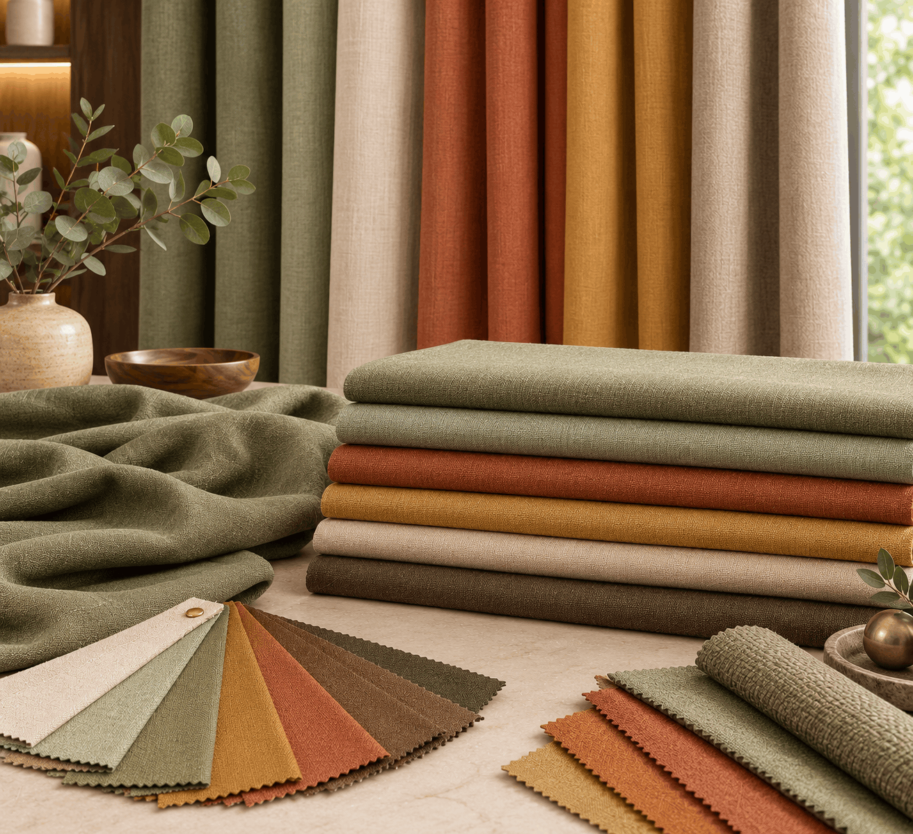
9. Texture Changes the Way Colour Looks
This is one of the most overlooked aspects of curtain selection.
The same colour can look completely different in:
- Linen
- Velvet
- Jacquard
- Chenille
- Textured fabric
- Silk-look fabric
- Embroidered fabric
- Sheer fabric
Why?
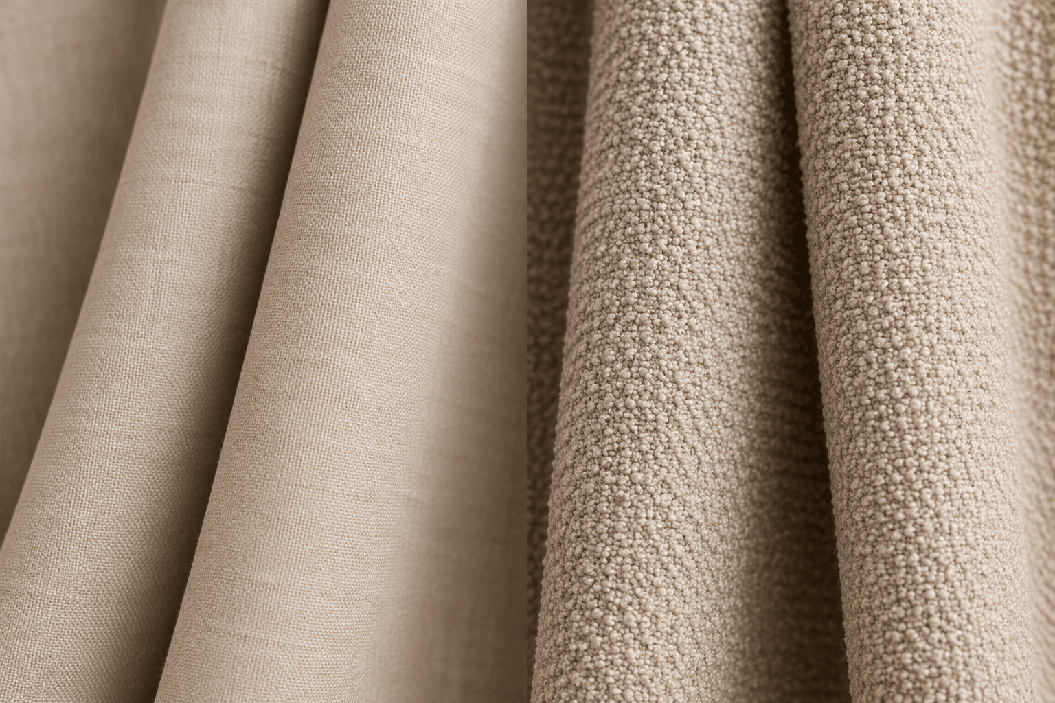
Because texture changes how light reflects from the surface.
A smooth fabric may appear cleaner and more uniform.
A textured fabric can create depth and variation.
This is one reason we recommend looking at the actual fabric sample, rather than deciding only from a colour card.
10. Patterned Curtains Need a Different Approach
If your room already has:
- Patterned wallpaper
- Printed upholstery
- Decorative rugs
- Statement furniture
- Large artwork
a heavily patterned curtain may make the room visually busy.
In such cases, a textured plain curtain can provide balance.
On the other hand, if your room is relatively simple, a patterned or embroidered curtain can become an important design element.
The question is not:
“Plain or patterned?”
It is:
“Where should the visual interest be?”
11. What About Bedrooms?
Bedrooms usually benefit from a more restful colour palette.
Popular directions include:
- Warm neutrals
- Soft beige
- Taupe
- Dusty blue
- Muted green
- Soft grey
- Deeper earthy colours
But colour is only one part of the decision.
You should also consider:
Privacy + light control + fabric + lining + curtain style.
A beautiful curtain that doesn’t provide the required privacy or light control may not be the right bedroom solution.
This is where a combination of sheer + dimout or blackout can become useful, depending on the room and the customer’s requirements.
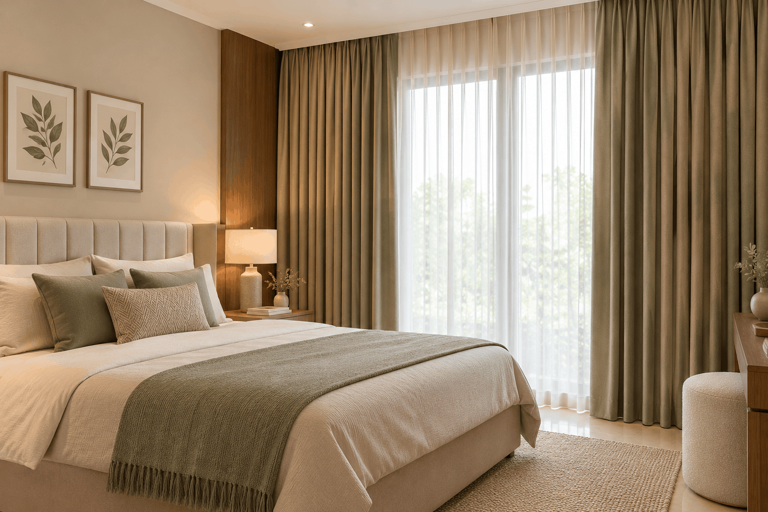
12. What About Living Rooms?
The living room generally gives you more freedom.
You can choose:
Quiet and Elegant
Warm ivory + beige + taupe
Natural and Relaxed
Linen tones + sage + olive
Rich and Luxurious
Deep green + navy + plum + warm neutrals
Contemporary
Warm greige + stone + charcoal
Statement Interior
A deeper or more distinctive curtain colour used as an accent.
Current Indian interior coverage is also showing interest in earthy tones, muted greens and richer accent colours, although colour choice should always be adapted to the specific room rather than following a trend blindly.
13. Should Every Room Have the Same Curtain Colour?
No.
But there should ideally be some connection between rooms.
For example, throughout a home you might use:
Living Room: Warm beige
Dining: Slightly deeper taupe
Master Bedroom: Soft olive
Guest Bedroom: Warm ivory
The colours don’t need to be identical.
They can belong to the same overall palette.
This gives the home a sense of continuity without making every room look the same.
For an entire apartment or villa, planning the curtain palette together can also prevent every room from ending up with unrelated colours and finishes.
14. What About Sheer Curtains?
Sheers deserve special attention because their colour behaves differently from a thick curtain.
A sheer fabric interacts with the light behind it.
A soft ivory sheer may appear warm and luminous during the day.
A grey sheer may create a cooler atmosphere.
A coloured sheer can subtly tint the light entering the room.
This means you should evaluate a sheer against the actual window light, not simply against a catalogue.
At Zed’s, sheers and voiles are specifically selected for their ability to filter sunlight while creating an airy appearance.
15. Don't Forget the Curtain Hardware
Modern curtain design is increasingly moving toward clean, ceiling-mounted tracks and Wave/Ripple Fold styles, which allow the curtain fabric itself to become the main visual element.
That means the colour and texture of the curtain become even more important.
If the track is concealed or visually minimal, the eye sees:
Wall → Curtain → Floor → Furniture
as one composition.
This is one reason colour selection should be considered together with the overall curtain design.
A Simple Zed's Method for Choosing Curtain Colour
Before selecting a fabric, ask these seven questions:
1. What colour are my walls?
Warm or cool?
2. What colour is my sofa?
Does the curtain need to complement it or contrast with it?
3. What colour is my floor?
Warm wood? Marble? Tile? Carpet?
4. How much natural light enters the room?
Bright or relatively dark?
5. Do I want the curtain to blend in or stand out?
This is an important design decision.
6. Is the fabric plain, textured or patterned?
Texture can change the appearance of the colour.
7. What function does the curtain need to perform?
Sheer?
Privacy?
Dimout?
Blackout?
Layered?
Once you answer these questions, the number of suitable fabrics becomes much smaller.
And choosing becomes much easier.

Common Curtain Colour Mistakes
Mistake 1: Choosing From a Small Screen Image
Colours on screens can differ significantly from the actual fabric.
Mistake 2: Matching the Sofa Exactly
A coordinated colour relationship can often look more sophisticated than an exact match.
Mistake 3: Ignoring Undertones
Two beige fabrics can look completely different because one may be warmer and the other cooler.
Mistake 4: Ignoring Natural Light
The room’s lighting can change how the fabric appears.
Mistake 5: Choosing a Trend Instead of Your Room
A colour can be fashionable and still be wrong for your interior.
Mistake 6: Forgetting Texture
Colour alone does not determine how a curtain looks.
Mistake 7: Selecting the Curtain Before Considering the Complete Window Treatment
Fabric, lining, fullness, pleat style and track all contribute to the final appearance.
Zed's Expert Insight
Don’t choose your curtain colour from the curtain catalogue alone.
Look at the room.
Look at the walls.
Look at the sofa.
Look at the flooring.
Look at the natural light.
Then look at the fabric.
The perfect curtain colour is not necessarily the colour you liked first.
It is the colour that makes everything else in the room look right.
And sometimes, the most beautiful result isn’t created by matching colours—it is created by choosing colours that belong together.
Final Thoughts
Curtains are much more than a functional covering for a window.
They occupy a large visual area and can influence the mood, balance and character of an entire room.
When selecting curtain colour, consider the complete interior rather than choosing a colour in isolation.
Think about:
Walls + Sofa + Flooring + Light + Fabric + Texture + Function + Overall Style
And remember that there is no universal “best curtain colour.”
There is only the colour that is right for your room.
At Zed’s, our curtain consultation process brings together fabric selection, colour, light control, styling, measurement, tailoring and professional installation to create a complete window treatment.
Frequently Asked Questions
Should curtains match the walls?
They can, but they don’t have to. Curtains can blend with the wall colour, complement it or create a deliberate contrast.
Should curtains match the sofa?
Not necessarily. It is often better to choose a colour that complements the sofa rather than matching it exactly.
What curtain colour makes a room look bigger?
Lighter colours such as warm white, ivory, beige and soft neutral tones can create a visually lighter and more open appearance.
Are beige curtains outdated?
No. Beige remains a versatile neutral. The specific shade, fabric texture and combination with the rest of the room determine whether it looks contemporary.
What are good curtain colours for a bedroom?
Soft neutrals, muted greens, dusty blues, taupes and other restful colours can work well, but light control and privacy should also be considered.
What are good curtain colours for a living room?
There is no single best colour. Warm neutrals, earthy tones, muted greens, blues and richer accent colours can all work depending on the room.
Should all curtains in a house be the same colour?
No. Different rooms can have different colours while still sharing a coordinated overall palette.
Should I choose curtain colour before choosing the fabric?
It is better to consider colour and fabric together because texture, weave and light reflection can significantly change how a colour looks.
Explore Zed's Curtains
Explore the Zed’s collection of curtain fabrics, sheers, blackout and dimout options, custom curtain solutions and professional installation.